
Resident Advisor is the cultured, critical voice of the global clubbing and dance music community.
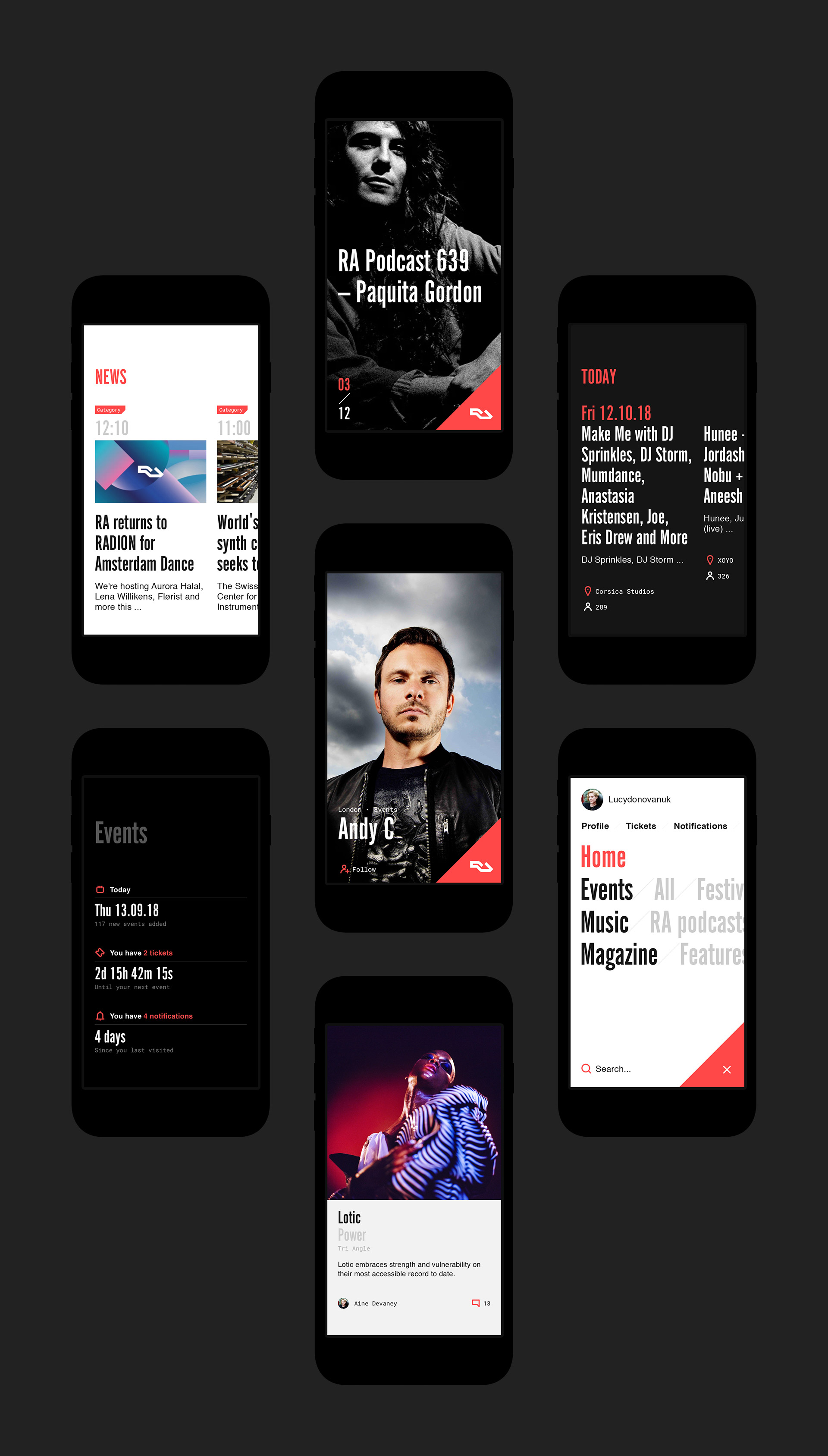
The old website had become dated, cluttered with information and wasn’t serving the needs of it’s users. A complete overhaul was required. An atomic design system approach was used, alongside a bold and highly typographic visual look and feel. The content was stripped right back serving you only what you need and letting you find it in the easiest way possible.
Agency
SOON_
Client
Resident Advisor
Disciplines
Digital
New direction
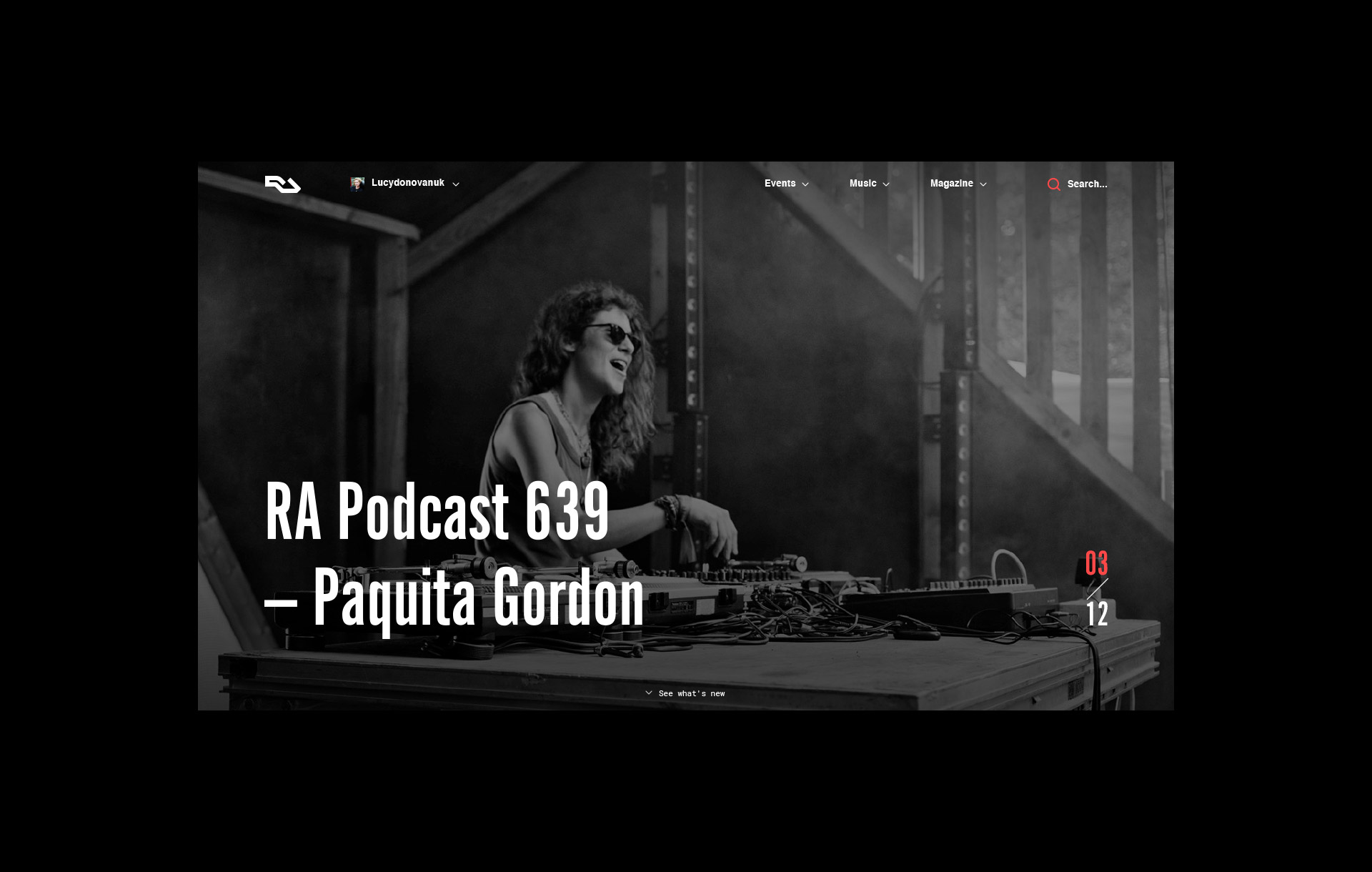
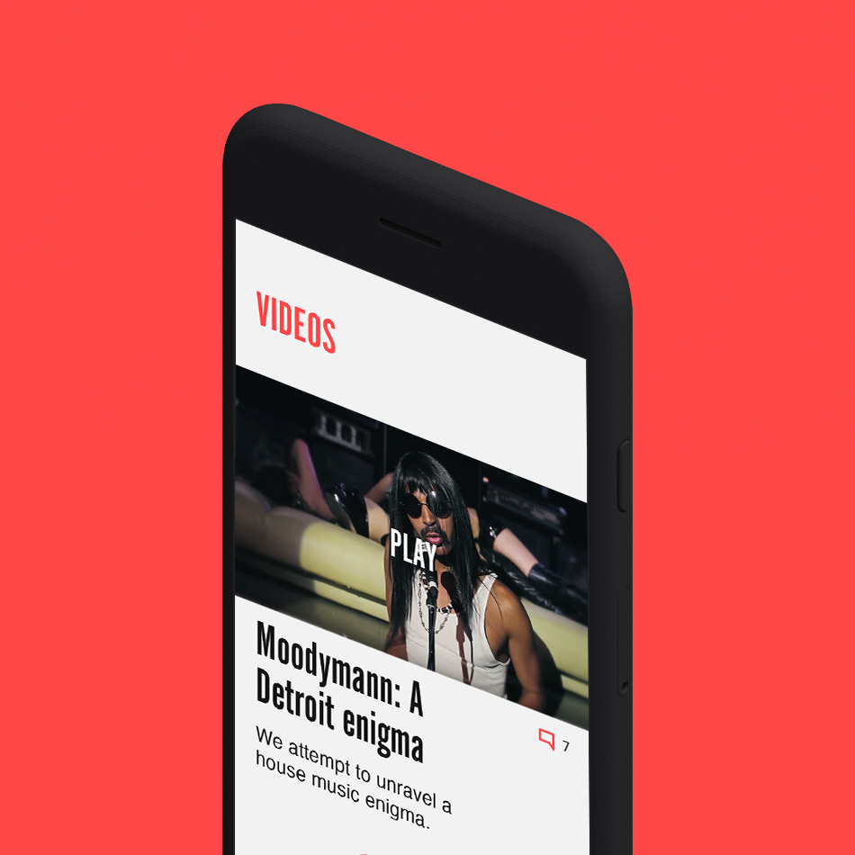
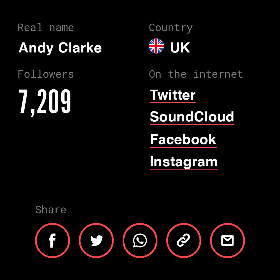
The key design decision was to strip things right back, take out alot of the clutter and clean things up, whilst at the same time giving it a completely fresh new look and feel.
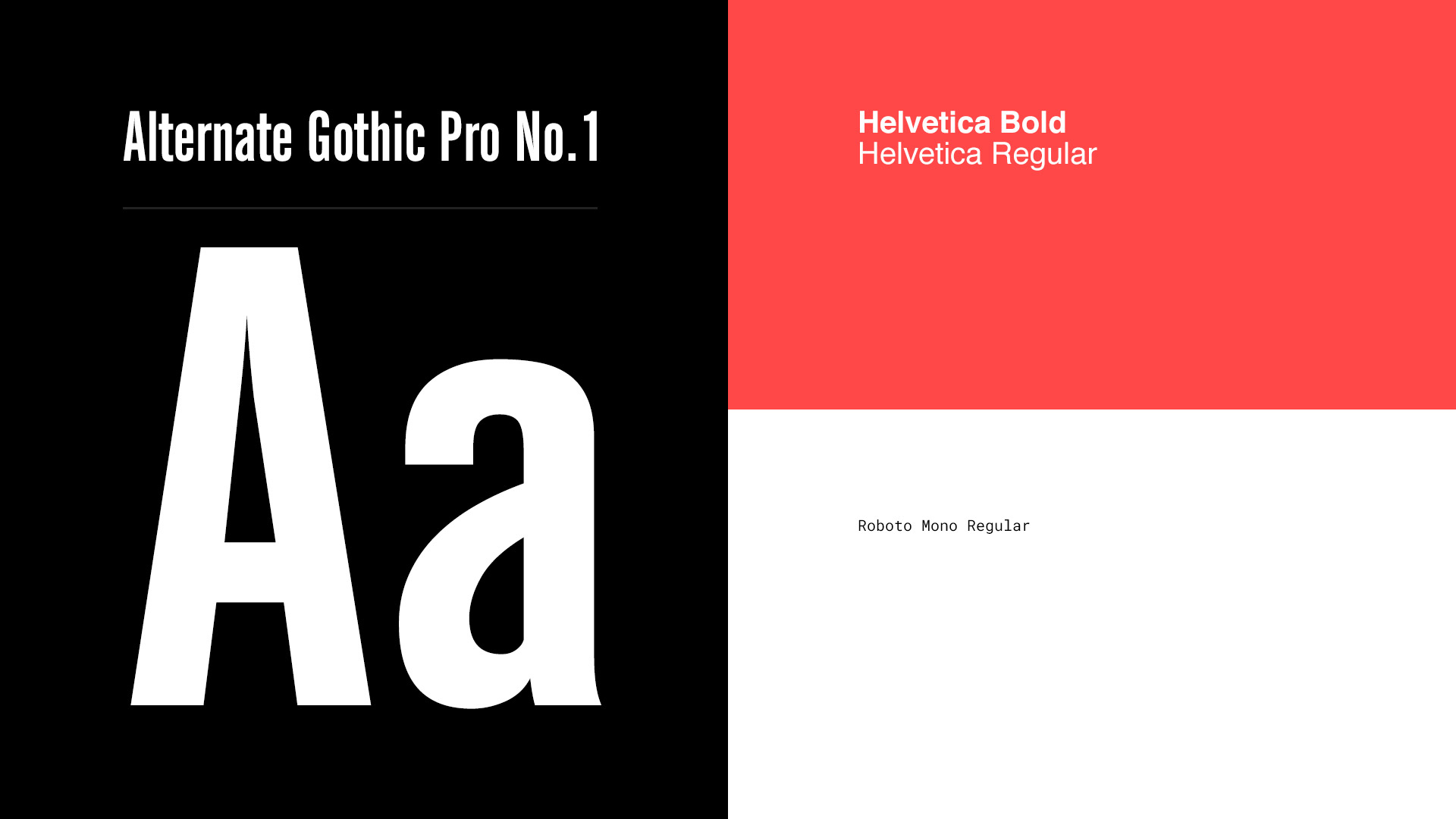
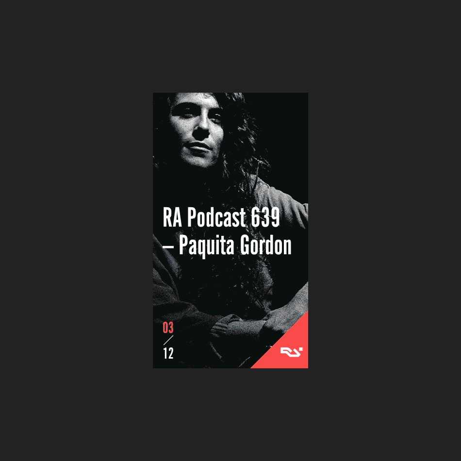
A bold new condensed typeface was introduced. This benefited in two ways, by providing more impact, but primarily as a way of fitting more words on the page, particularly on event listings. RA have alot of history with using Helvetica, so this was kept for body copy as a nod back to their heritage.
With a website of this nature, it’s paramount to draw the eye to key pieces of information, therefore the RA red was introduced as an interaction colour.
Mobile first
Particularly in the world of music and events more and more people are now using their phones to check out event information and book tickets on the go, from before the event right up until they are in the queue. During the discovery phase it was clear that a mobile first approach would be required.


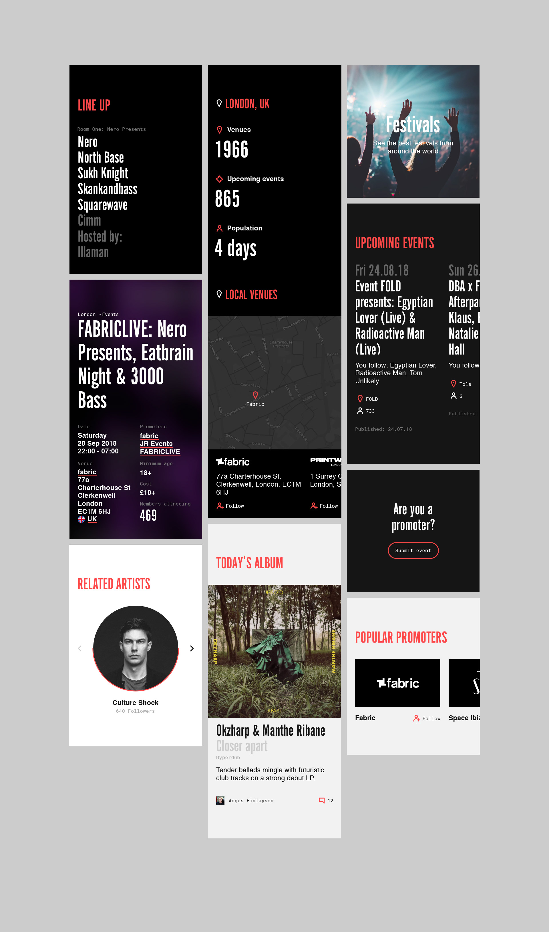

Desktop experience
Alongside mobile, the desktop experience was also very important. It allowed the bold typography and new, more minimal content layout to really shine, creating an engaging user experience across the entire journey.

More work

Batch LDNBrand Creation

RotoriousBrand Creation

LoopsBrand Creation
TravelLocalRebrand
RudojiPersonal Project