
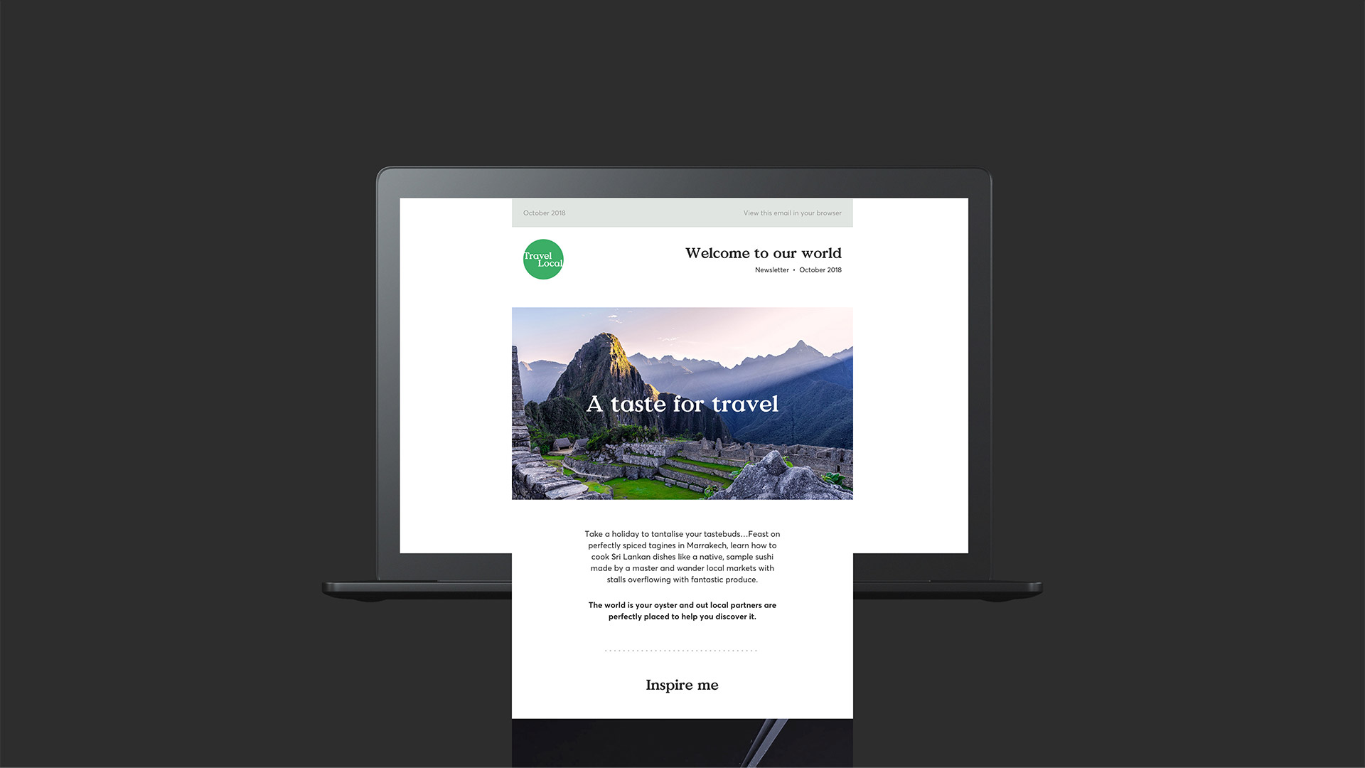
TravelLocal are all about bespoke travel, with a difference. They help you to create holidays your way, with carefully selected local experts in your chosen destination.
The task was to rebrand them into a ‘cult’ brand that resonates with a precise target audience. It had to feel human, yet premium. The work consisted of a full rebrand including a new brand identity, guidelines and a website reskin.
Agency
SOON_
Client
TravelLocal
Disciplines
Branding
Digital

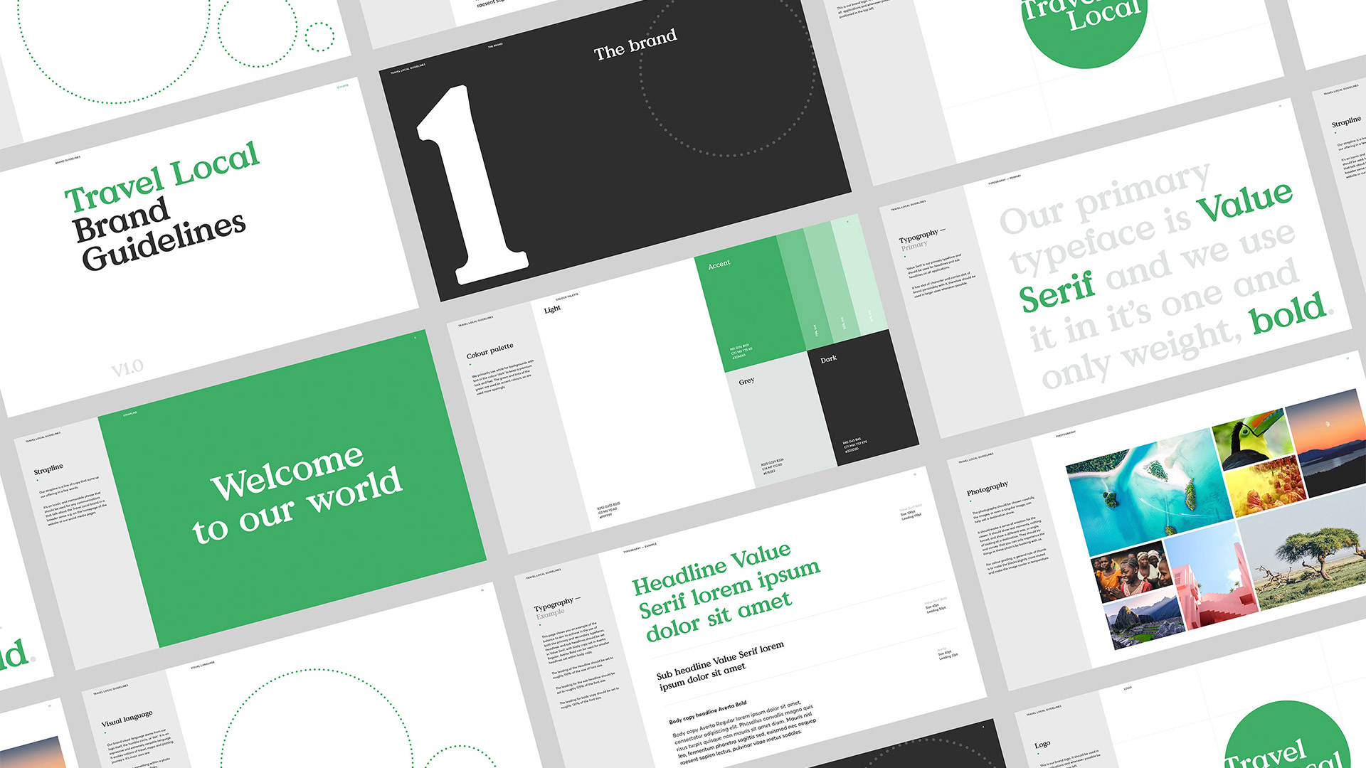
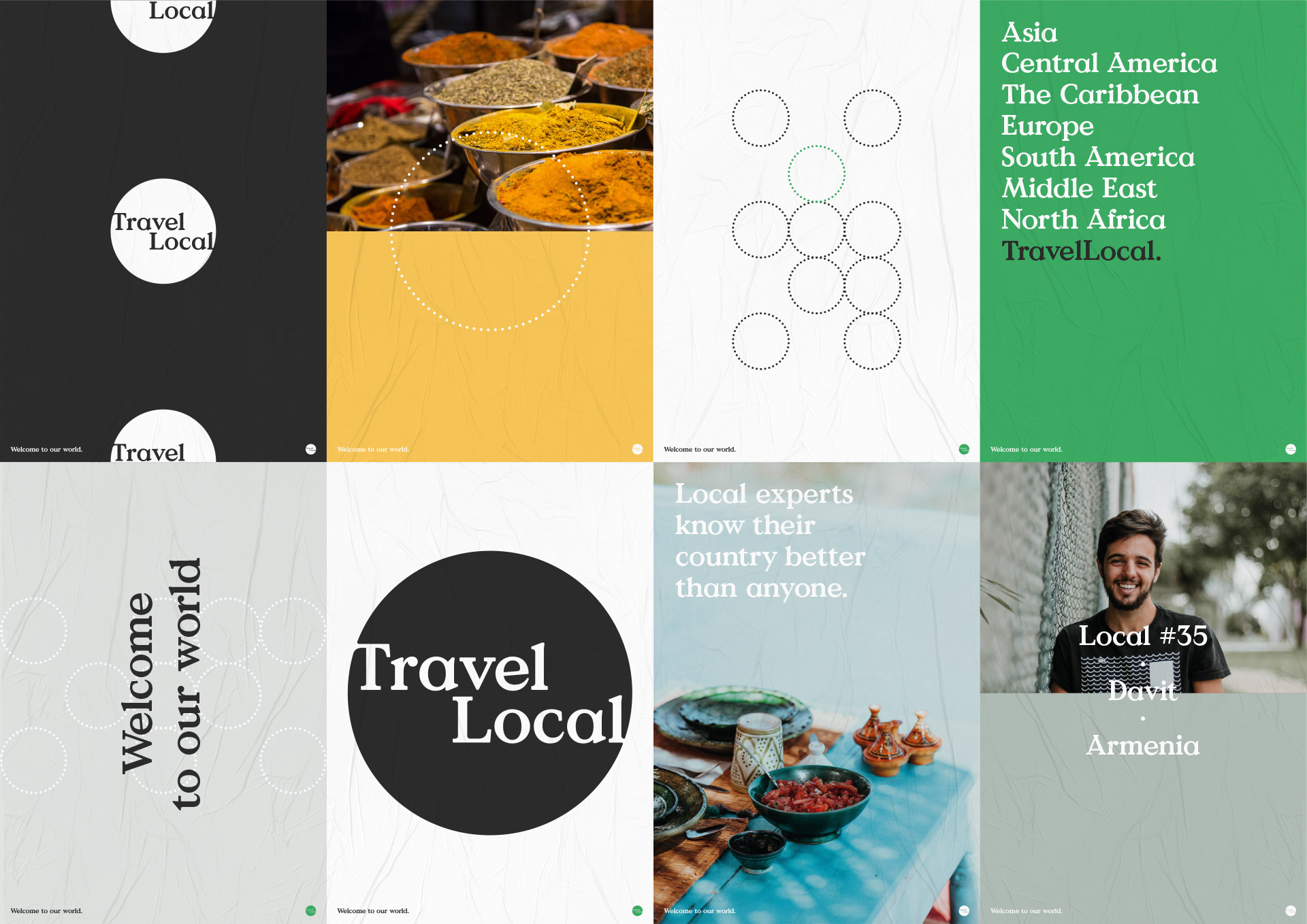
The brand
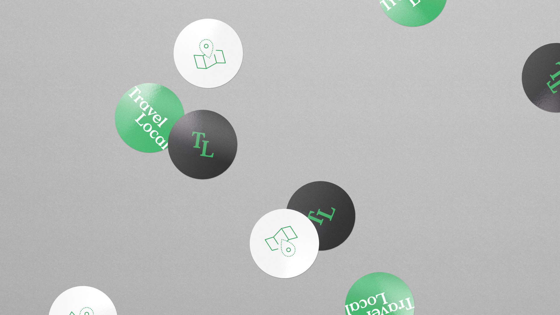
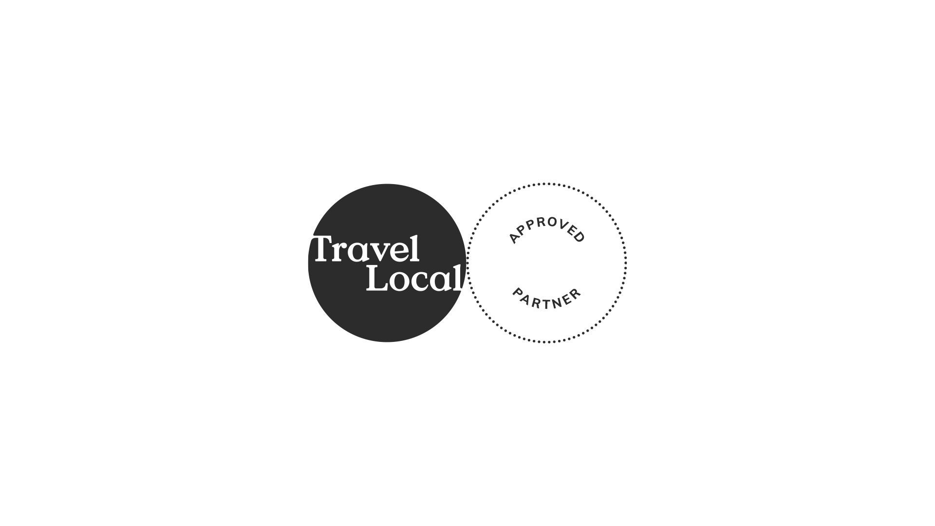
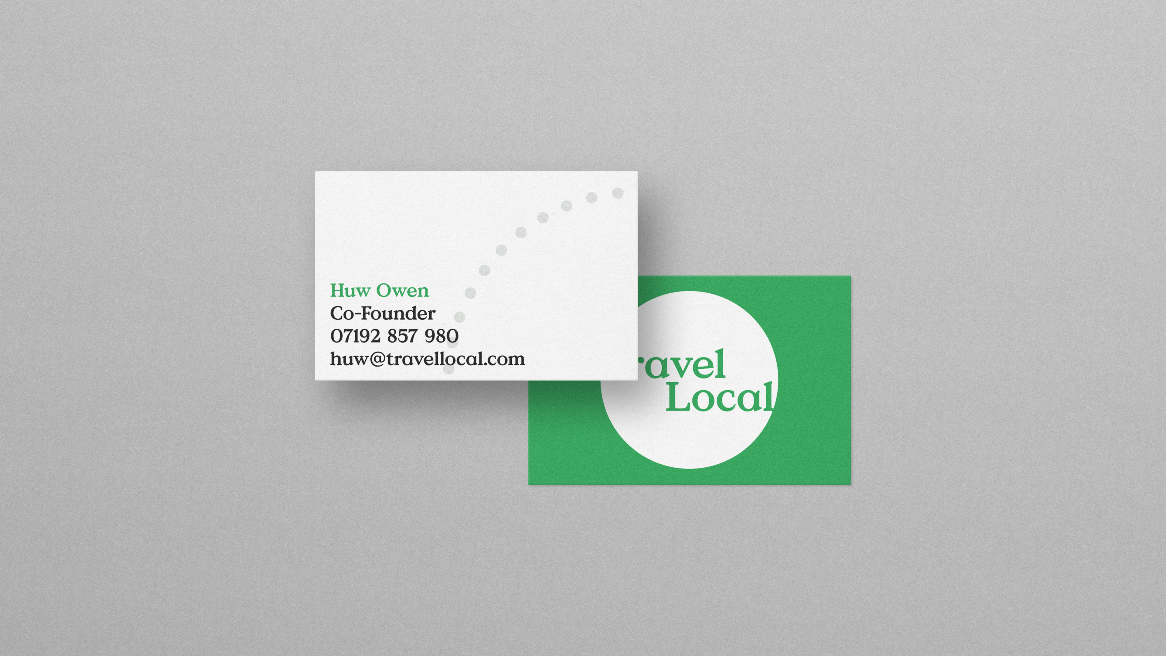
What could be more iconic than the humble circle. It has it’s obvious reference to the world we live in but when taken further it becomes a highly expressive graphical device.
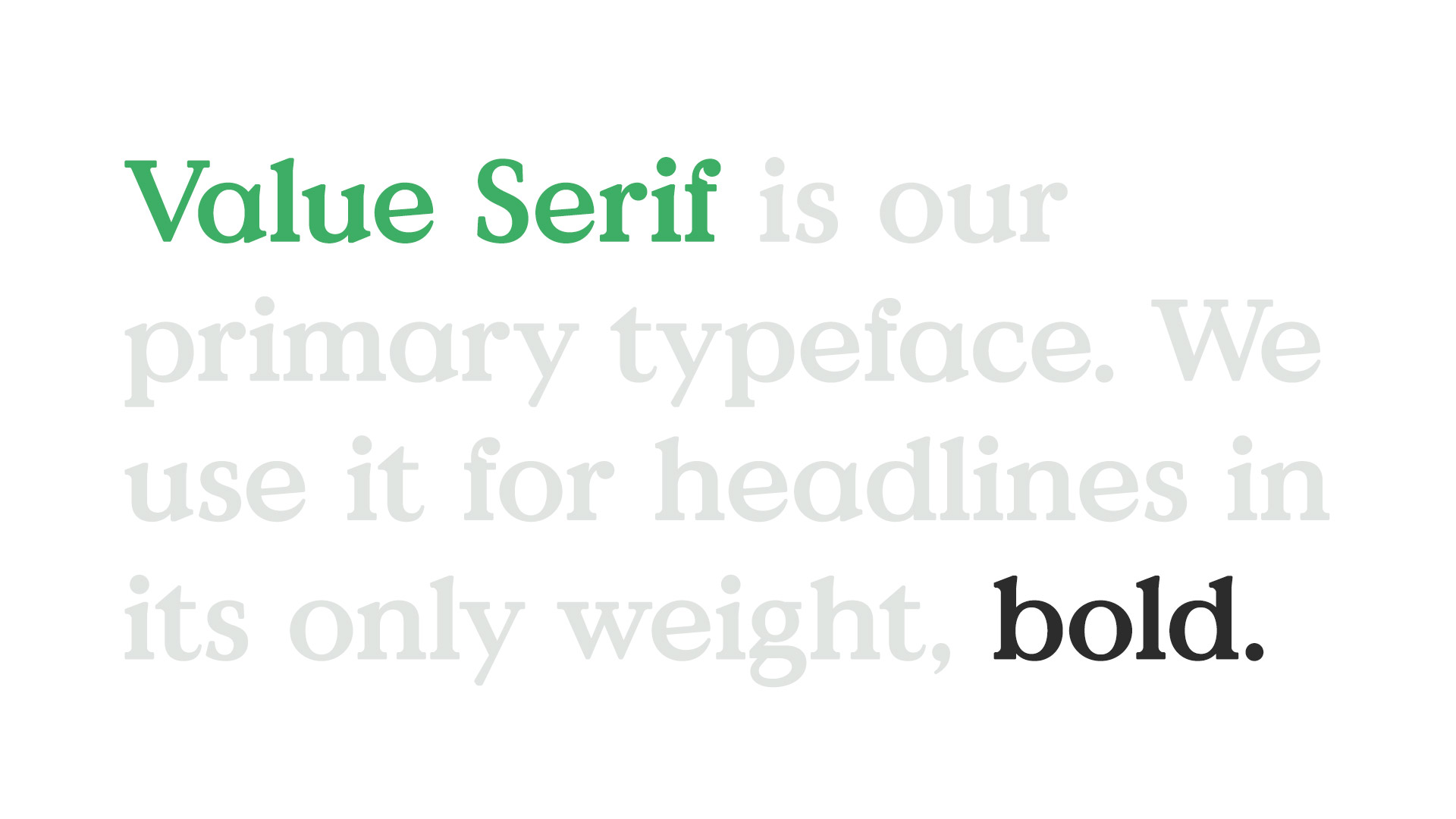
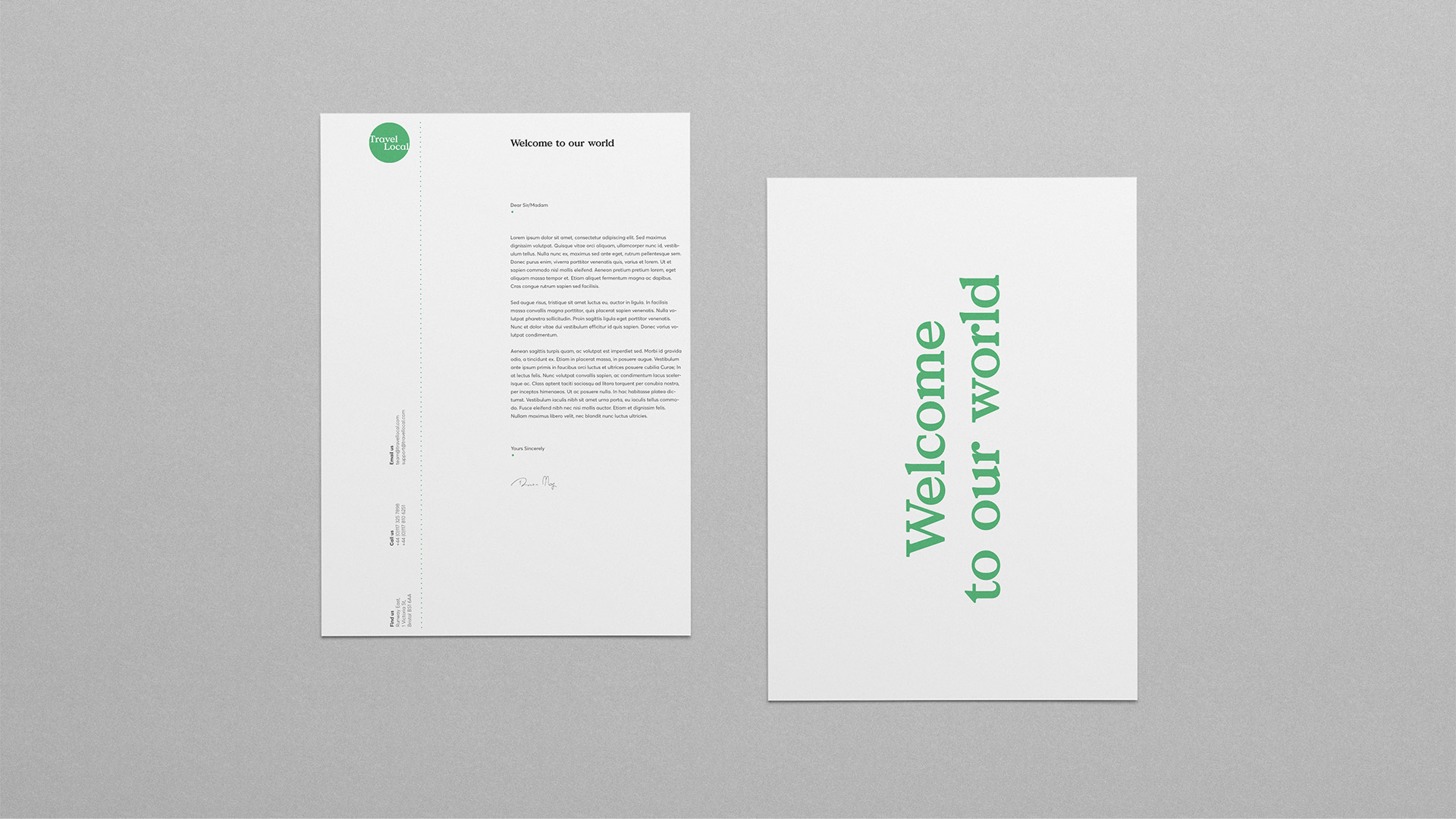
This was paired with a new primary typeface that was the perfect balance of modern and human yet screams with personality, which is exactly what the brand needed.
Secondary colour
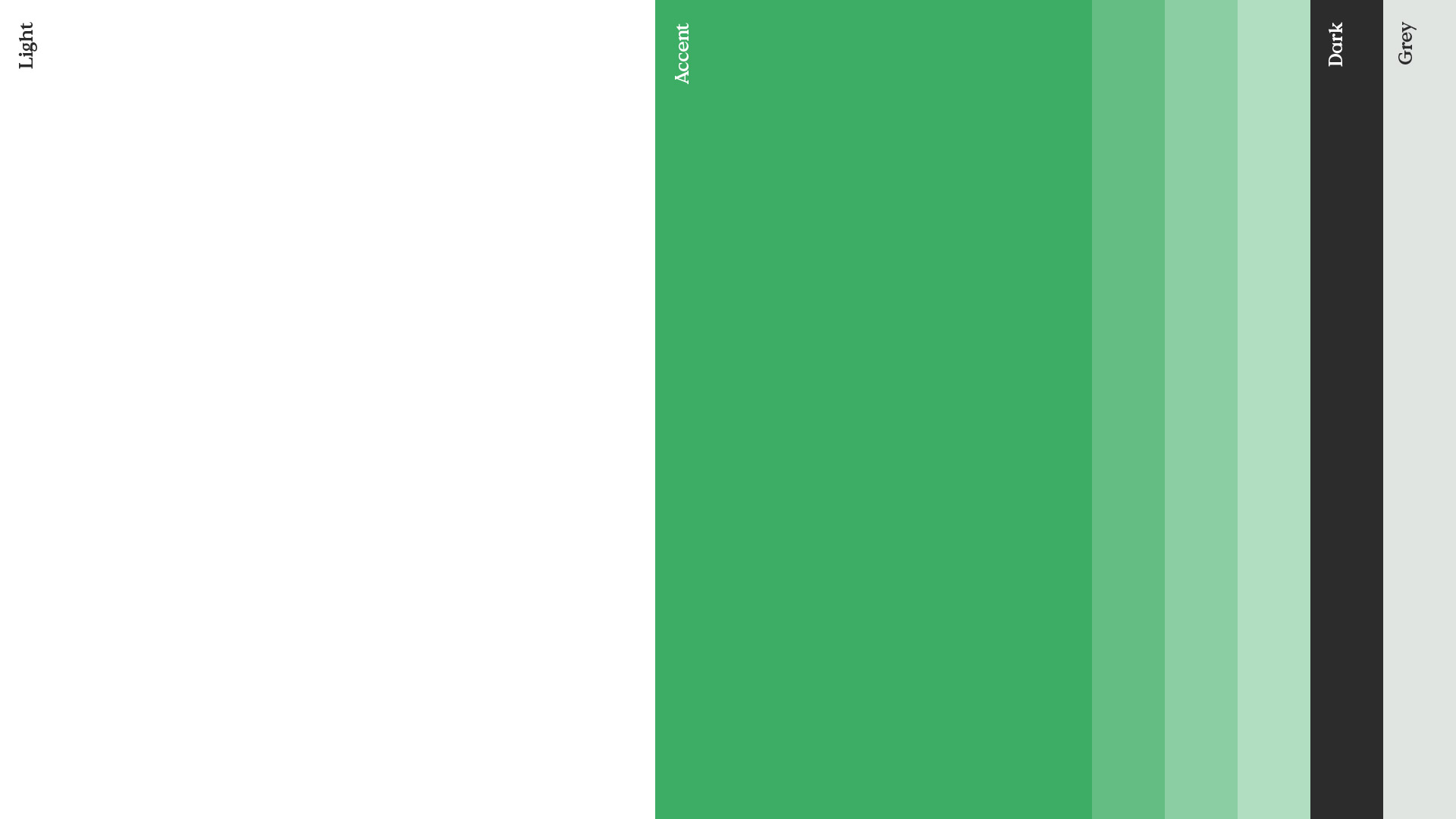
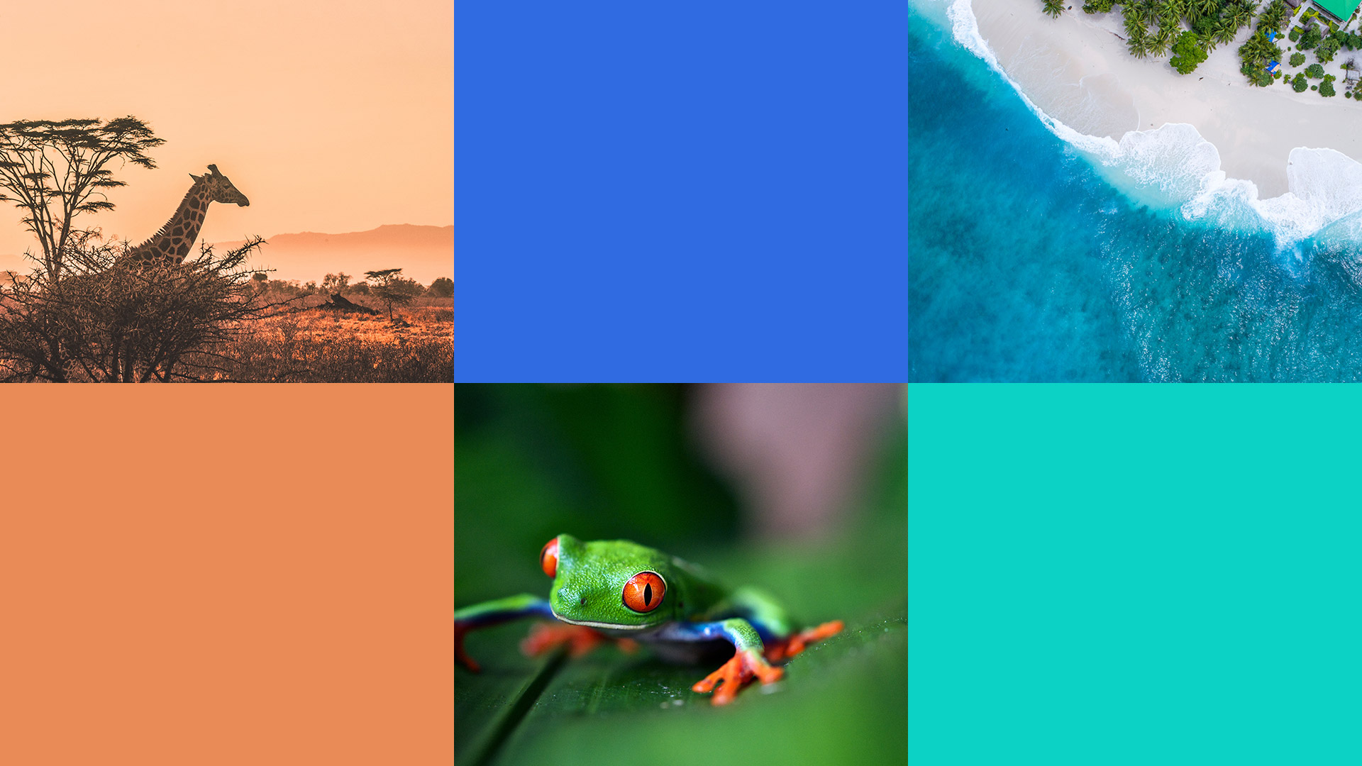
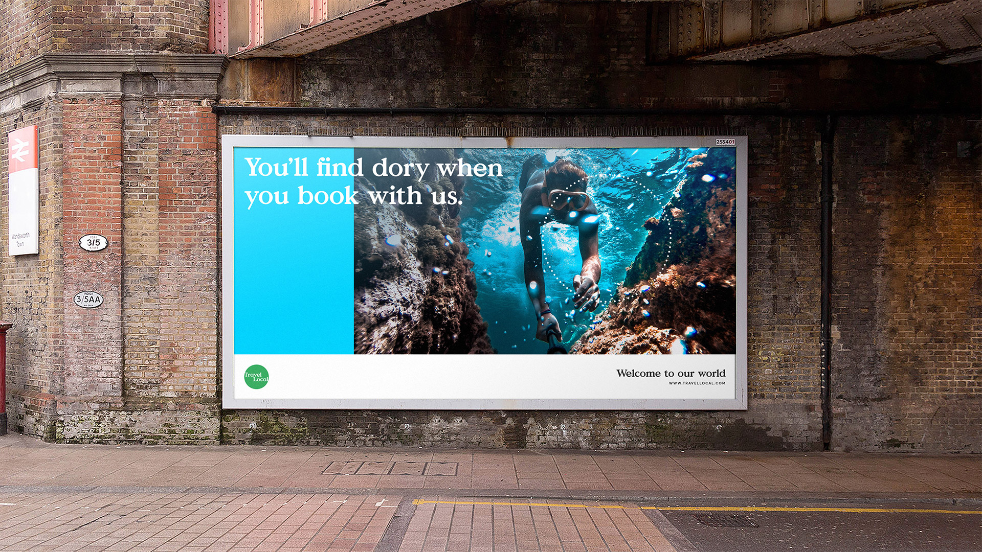
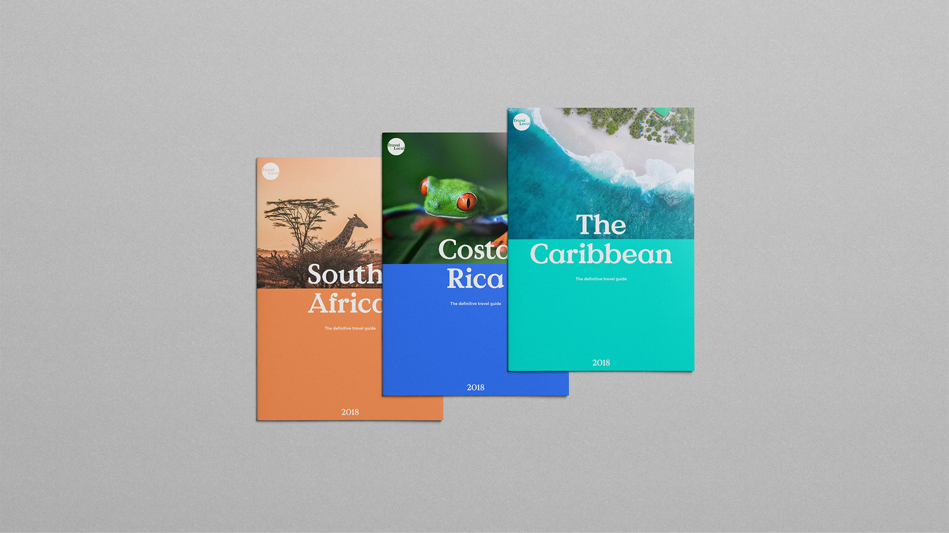
The primary palette was intentionally stripped back, using just one accent colour. There needed to be a way of using more. The simple yet clever solution was to combine photography and a colour picked from the image in a flexible, easy to use system.
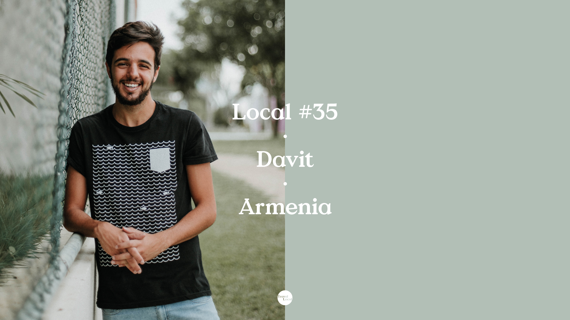
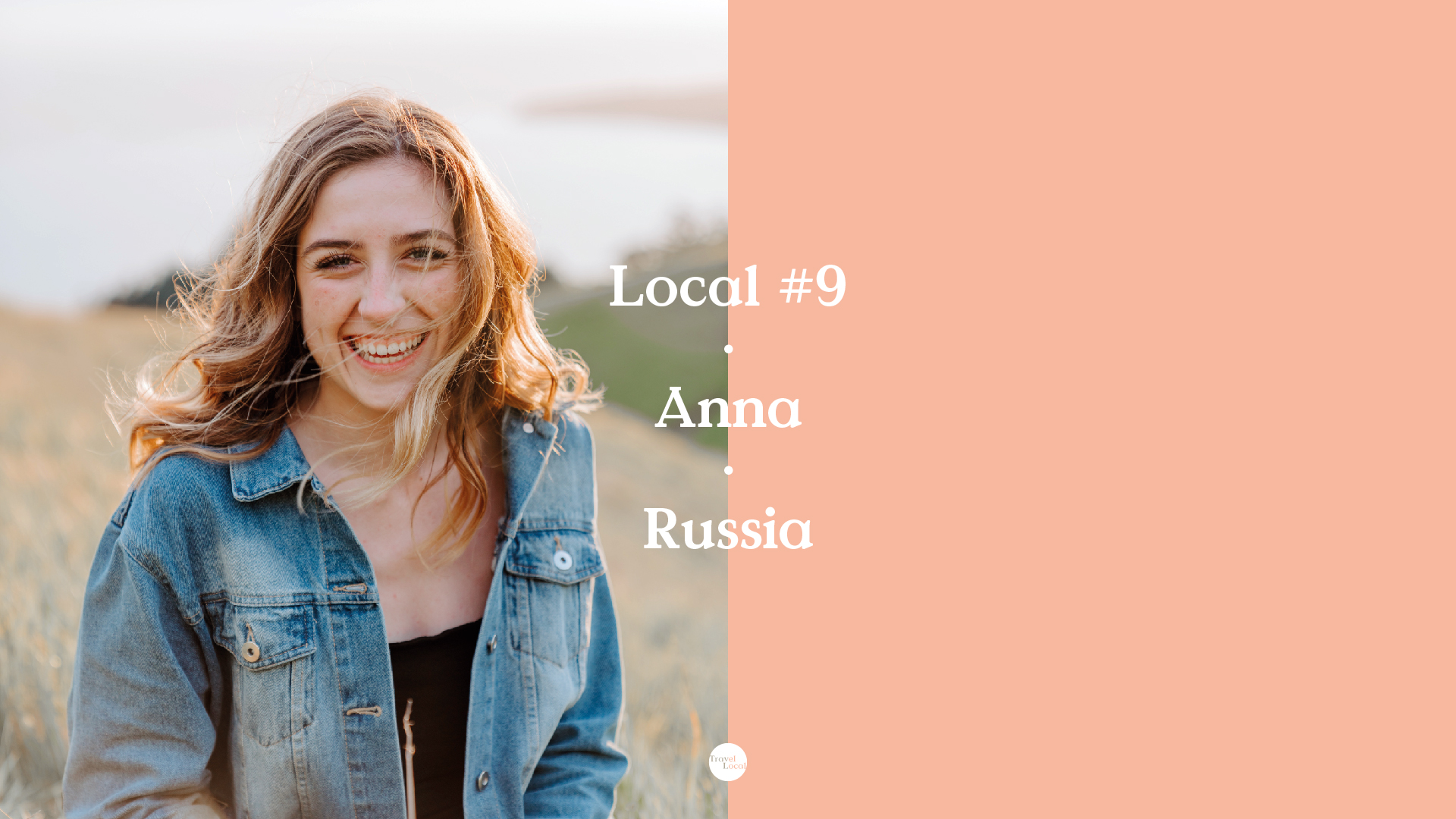
Connection
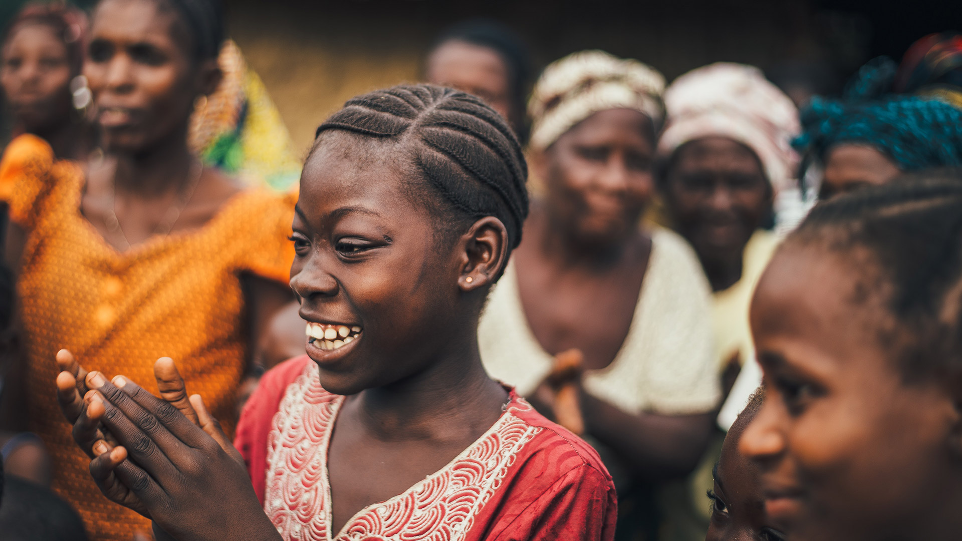
What makes travel local special is that they connect you with local experts in your destination. This needed to be celebrated, given more visibility and showcased as a key USP. When paired with the secondary colour palette this further enhanced that connection.

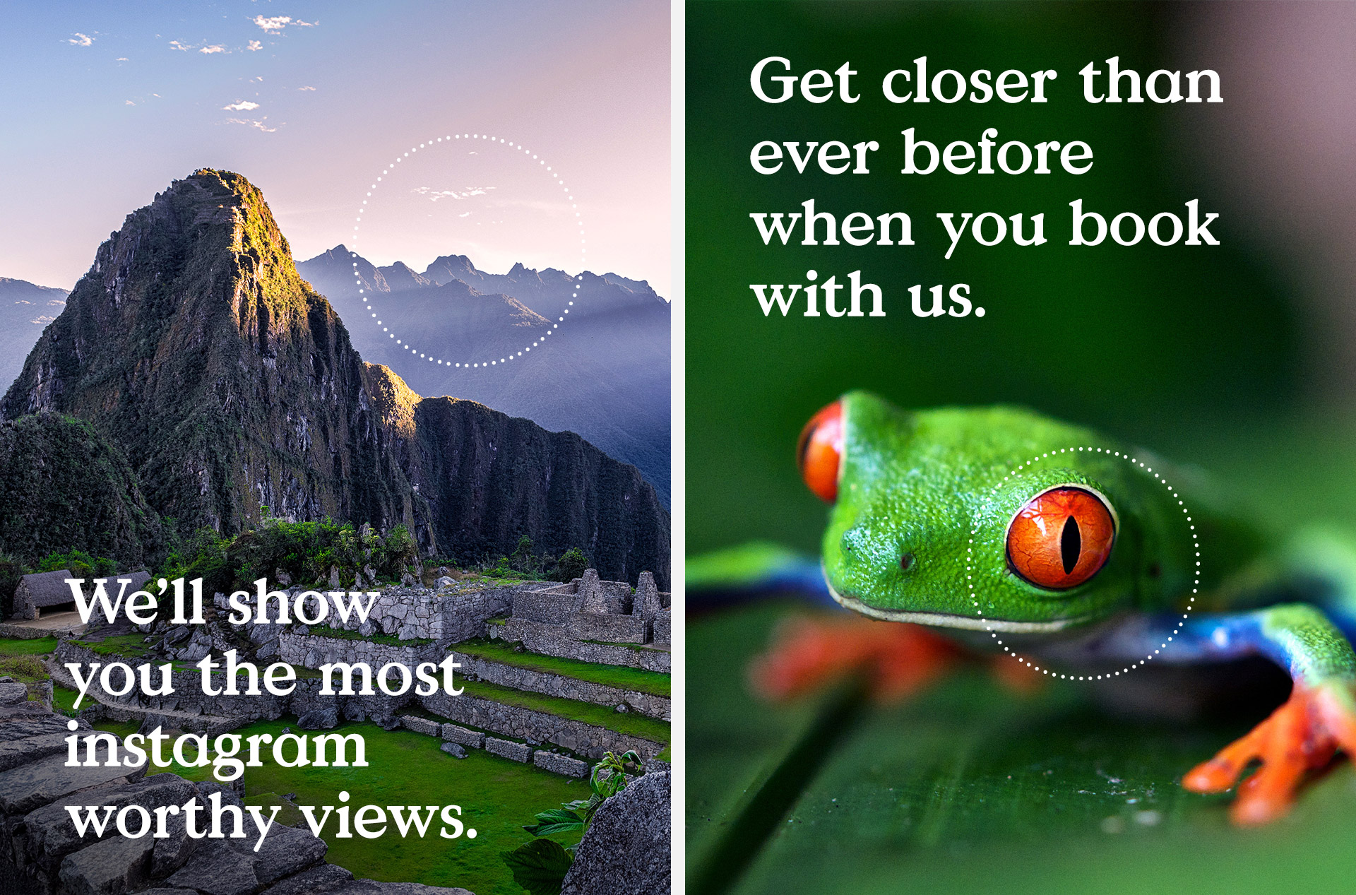
Visual language
Travellocal are able to offer truly unique, memorable moments that you only get by booking through them. There needed to be a way to capture this within the photography and the solution stemmed from the marque itself.
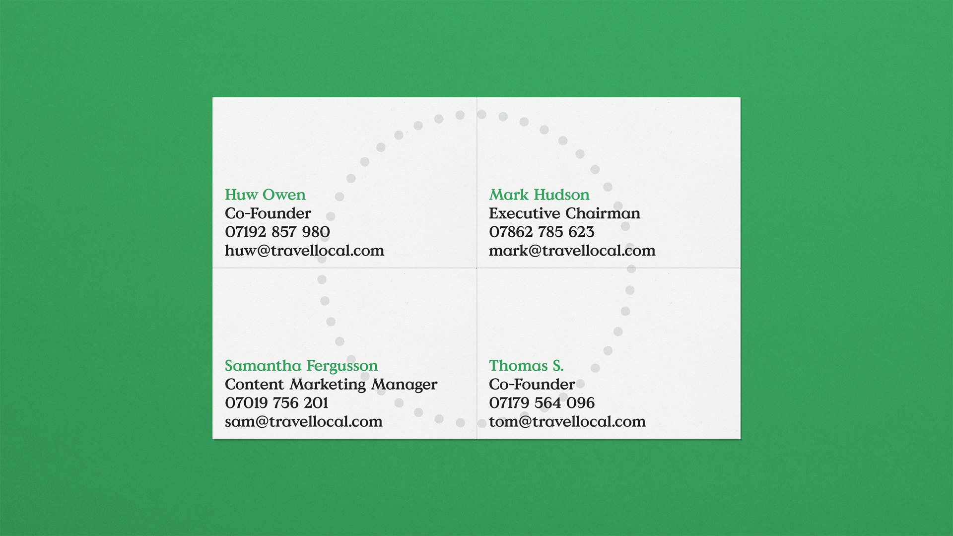
It evolved into a circular, dotted line as a way to highlight a particular ‘moment’ in a photo. But more than that it becomes a device that can be used for wayfinding, website elements, iconography and more.


More work

Batch LDNBrand Creation
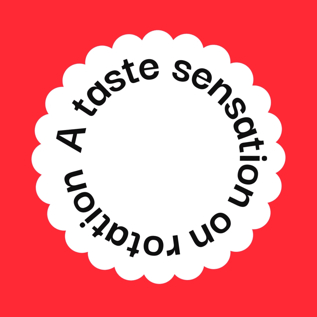
RotoriousBrand Creation

LoopsBrand Creation
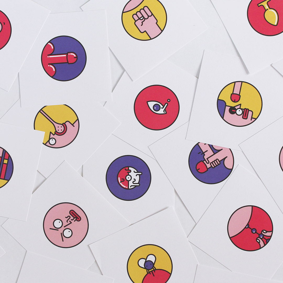
RudojiPersonal Project
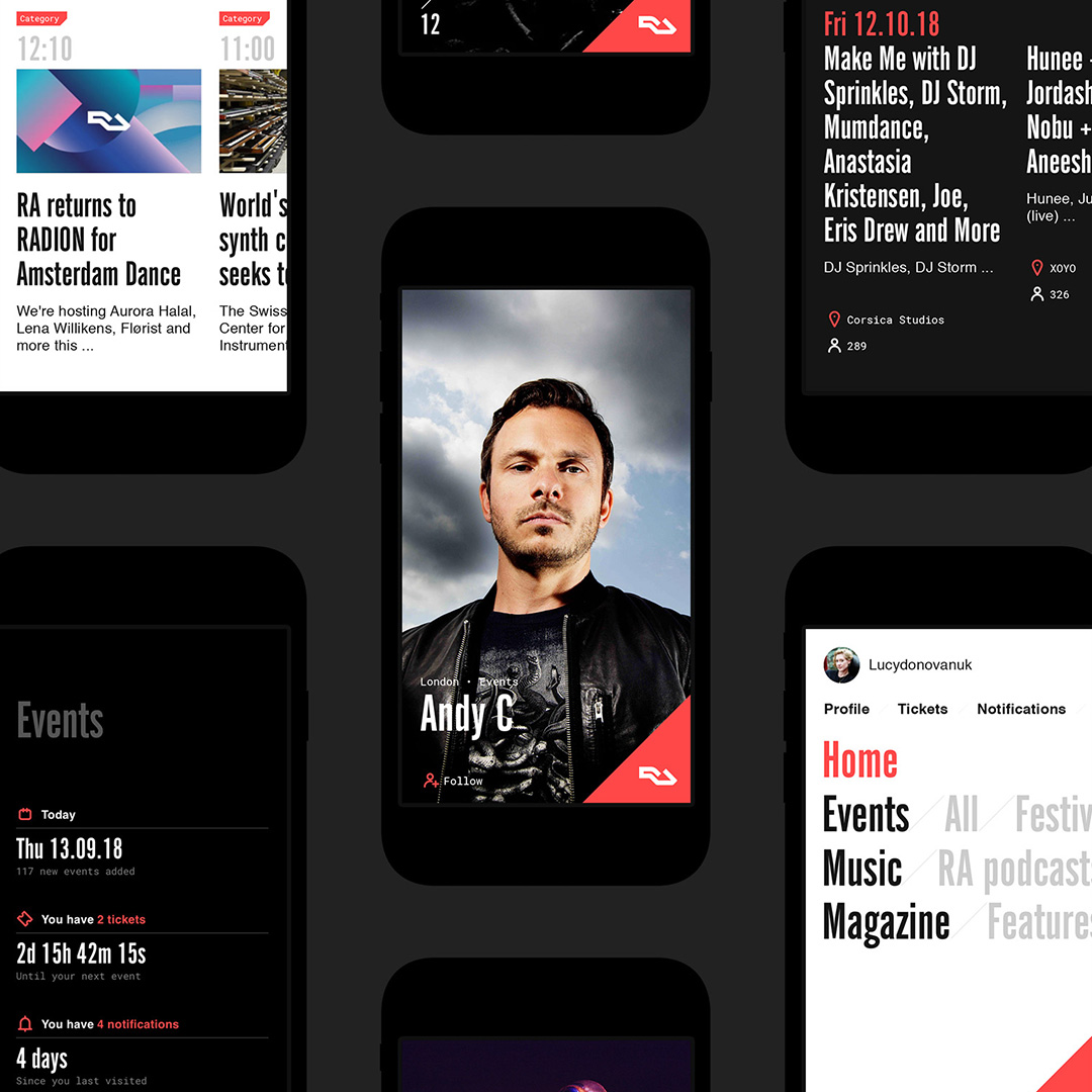
Resident AdvisorWebsite